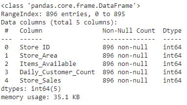
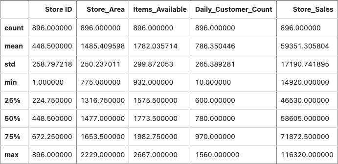
1. We found data from Kaggle, uploaded it to the CoCalc server to collaborate together using Python, imported Python packages, visualized the data, and trained different machine learning models.
2. We used information about some factors in a supermarket to predict store sales in order to help retail businesses become successful.
There are five different columns of data for the supermarkets: "Store ID," "Store_Area," "Items_Available," "Daily_Customer_Count," and "Store_Sales." Each column has 896 rows each with no null values.
This is a table showing different statistics for the five columns, which are "Store ID," "Store_Area," "Items_Available," "Daily_Customer_Count," and "Store_Sales." We added more columns of data later on because there are not many factors in the supermarkets shown in this table.
This scatter matrix is a set of different scatter plots for some of the columns in the data set. The scatter plots help show how the columns relate to each other. The variable "cus/sqr" is the total customer count divided by the supermarket's area.
This is a scatter plot to show the relationship between a store's area and the number of daily customers. The x-axis is the store area in square yards, and the y-axis is the number of daily customers. The sales of the stores are also represented by the different colors. There does not seem to be a strong linear relationship between the area of a store and the daily customers.
This is a scatter plot to show the relationship between a store's area and the number of items available. The x-axis is the store area in square yards, and the y-axis is the number of items available. The brighter the color, the more money the store made in sales. As you can see, there is a strong correlation between a store's area and how much items a store has.
We created a new categorical variable called "Store_Scale" based on the areas of the stores. The orange color or "0" represents small stores (area < 1300 square yards), the blue color or "1" represents medium stores (1300 square yards < area < 1700 square yards), and the green color represents large stores (area > 1700 square yards). The pie chart on the left shows how many customers went to a certain size of a store, and the pie chart on the right shows how many sales were from a certain size of a store.
This box plot shows the mean, the 25th percentile, the 75th percentile, the highest value, the lowest value, and any outliers for the store's area, items, and customers per day.
This is a histogram that shows the most common number of items in a store, the most common area of a store, and the most common number of customers in a store daily.
This heat map shows the correlation between some of the columns in the data table. The strongest possible positive correlation is a value of 1, and the strongest possible negative correlation is a value of -1. As you can see in this heat map, the correlations range from -0.5 to 1. The correlations of this heat map can be seen by hovering over the boxes. The brighter the color or the more yellow a color, the stronger the positive correlation. The darker the color or the more blue a color, the stronger the negative correlation. For example, store area and items available create a yellow box with basically a correlation of 1, while the total customers over the area of the store creates a blue box with a correlation of -0.486.
There are not any correlations to the store sales. In the heat map above, store sales have close to zero relationship with the other factors in a supermarket.
Collinearity is like the correlation between the independent variables, shown in the heat map. The only clear collinearity is postive, which is between the area of the store and the available items. There is some collinearity between the total customers divided by the store area and the area of the store.
Outliers are pieces of data that fall outside of the range of the majority of the pieces of data. In addition to seeing the outliers on the box plot, we used the Local Outlier Factor method in Python to determine whether each value in the columns in the data table was an outlier or not. Then we changed the data table to include only non-outliers.
Missing values can hurt the accuracy of our machine learning models. In this data set, there were no missing values. However, if there were missing values, we could have deleted the sections with missing values or replaced the missing values with the median or mean values.
Our machine learning model is used to predict regression in how much a supermarket will earn daily from sales. We decided to measure the accuracy of the predictions through the mean absolute error (MAE). A lower MAE should indicate a better prediction. However, we noticed that a lower mean absolute error is not necessarily good for our machine learning. A lower mean absolute error often resulted in the predicted data being more centered and therefore less spread out so that stores that were higher- and lower-income could not be represented, creating a middle-income majority of stores, which caused imbalanced data.
Regression analysis is a way of mathematically sorting out which variables have an impact on an analysis of data, such as which factors matter most and least, and how the factors interact with each other. It also judges the certainty about all these factors. There is a clear correlation between the effect of the independent variable (the known factors which impact on the dependent variable) on the dependent variable (factor that you’re trying to understand or predict), whose overall trend is linear.
Pros: Works well with non-linear data, better accuracy than classification algorithms. Cons: Found to be biased when dealing with categorical variables, very slow to train. An estimator algorithm that aggregates the results of many decision trees and outputs the most optimal result. The trees protect each other from individual errors.
Pros: Decreases bias error, can be utilized for regression and classification problems, the training speed is much faster as well as efficient due to histogram based algorithm (bucketing continuous feature values into discrete bins). Cons: Due to its algorithm constantly improving errors this could lead to overemphasized outliers and cause over fitting. It is also computationally expensive, requiring many trees which is memory and time exhausting.
XGBoosting can be used for classification and regression. XGBoosting is similar to Random Forest Regression because of the use of trees. The trees’ outputs are combined. In XGBoosting, each tree will improve on the preceding tree’s outcome. Pros: XGBoosting is very popular for Kaggle data competitions and efficient. XGBoosting can be used for modeling highly complicated relationships. Cons: XGBoosting does not work on data that is not organized, and tuning XGBoosting is more difficult. An XGBoosting learning rate that is too quick will not be accurate. An XGBoosting learning rate that is too slow will not be quick to be accurate. XGBoosting may result in overfitting.
Neural networks are very accurate in determining the patterns that exist within linear and non-linear patterns within datasets, which makes them more powerful/useful than other regression models like linear regression that fail for non-linear datasets. Once trained enough, the neural network can work accurately with a completely new set of inputs included ones that it has never seen before and make accurate predictions with it. Take a relatively longer amount of time to be trained and determine the underlying patterns that exist within the dataset similar to how the human brain functions. It takes a lot of processing power even for simple training with minimal hidden layers, so is not plausible for every user and every instance of using a machine learning model.
Pro: Polynomial regression provides an accurate approximation between the dependent and independent variables. Fits a wide range of curvature and broad range of functions. Con: Sensitive to outliers and can change data drastically. Fewer model validation tools for detection of outliers in nonlinear regression models.
Pro: This model can be used for both classification and regression problems, and is easy to visualize, interpret, and understand. Data preparation during pre-processing in a decision tree requires less effort and does not require normalization of data. Decision tree is not influenced by missing information or outliers. Con: Overfitting happens when the learning algorithm continues developing hypotheses that reduce the training set error but at the cost of increasing test set error. Decision tree can not be used well with continuous numerical variables.
The elastic net method performs variable selection and regularization simultaneously. The elastic net technique is most appropriate where the dimensional data is greater than the number of samples used. Elastic net is better for handling collinearity compared to models such as lasso.
Machine Learning Model | Mean Absolute Error |
---|---|
Linear Regreesion | 14294.48 |
Random Forest Regreesion | 15684.40 |
XGBoosting Regreesion | 19106.32 |
Gradient Boosting | 15198.76 |
Neural Network | 14505.91 |
Polynomial Regression | 13855.46 |
Elastic Net | 14533.45 |
The goal MAE (Mean Absolute Error) was set at 13228.
The MAE of all the models we implemented can be seen in the bar chart on the left, which is our metric for measuring the performance of our machine learning models
The Polynomial Regression (degree = 2) has the lowest MAE, 13855.46.
The Polynomial Regression Model's predictions are, on average, more accurate than the other machine learning models' predictions.
1. Our supermarket analysis model predicts store sales (in USD) based on a variety of factors such as items available, area of the store (square yards), daily customers, the size of the store (small, medium, large), and total customers/area to form the most effective solution for attracting customers and increasing sales.
2. Thanks to Pandas, NumPy, Plotly, Matplotlib, and Seaborn being imported into Python, we were able to visualize our data using scatter plots, pie charts, histograms, and more. We also removed outliers from our data because they would make our predictions less accurate. We trained seven different algorithms for machine learning using our supermarket data.
1. There was no data on the hours the supermarkets were open for. Supermarkets that were open for longer hours might have more sales than supermarkets that were open for shorter hours just because there was more time for customers to purchase from stores that were open for longer hours. We recommend that the supermarket data set also has how much time the store was operating for daily.
2. We noticed that a lower mean absolute error is not necessarily good for our machine learning. A lower mean absolute error sometimes resulted in the predicted data being more centered and therefore less spread out. We should find a balance between the mean absolute error and the diversity of the data so that stores that are higher- and lower-income could be represented rather than just the middle-income majority of stores.
1. In the future, we could use a larger data set. Our project had only 896 pieces of data, but there are other data sets with thousands of pieces of data. A larger data set would lead to more accurate predictions.
2. We could focus on a single type of store, for example Walmart. Focusing on a single type of store can help make more accurate predictions because there will be a control. This will make our final project more accurate with its predictions.